Branding Photography for San Francisco The Center for the Book
San Francisco Center for the Book
Case study · branding PHOTOGRAPHY FOR AN ARTS Non-Profit organization
The Client
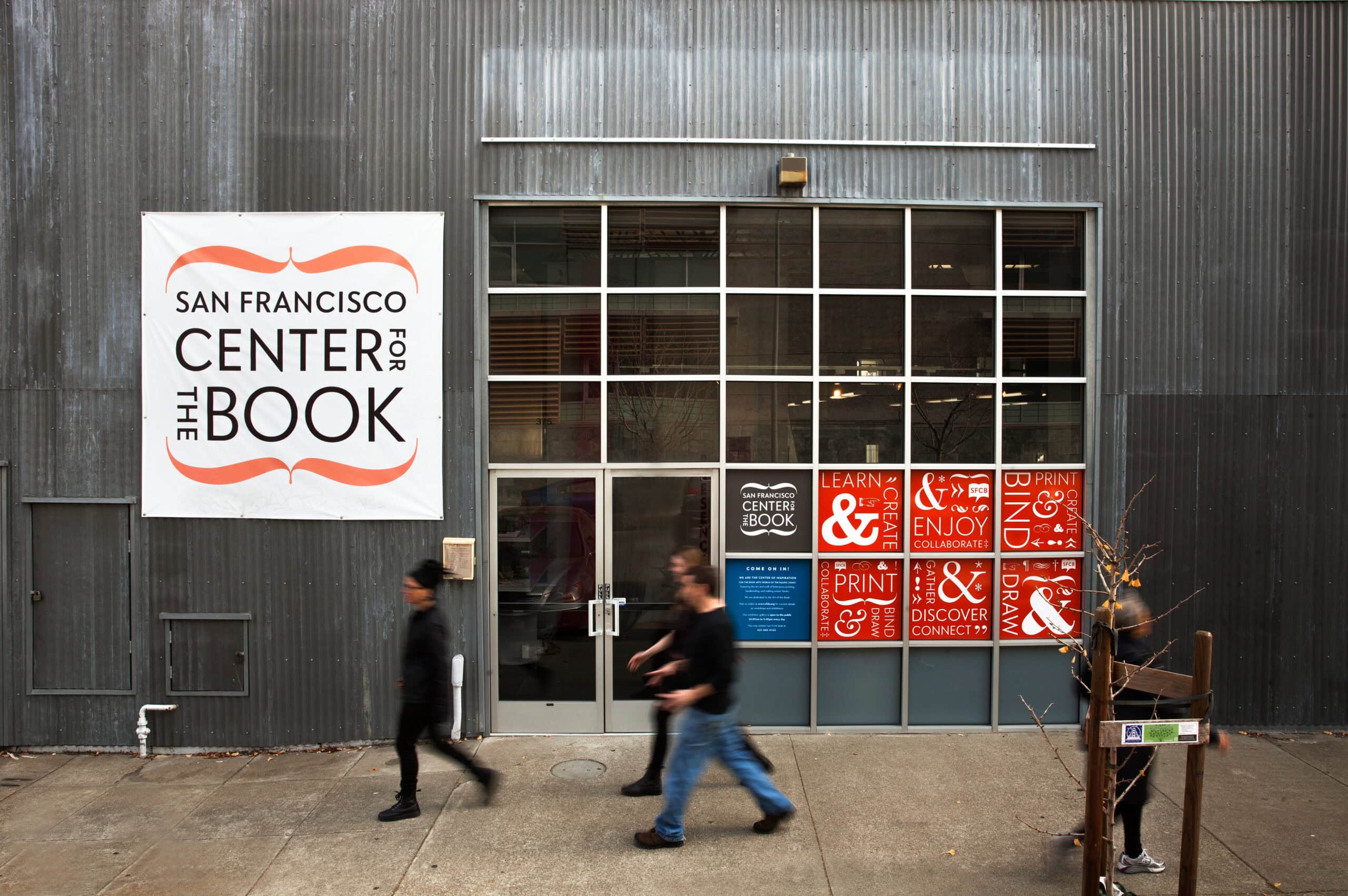
The San Francisco Center for the Book (SFCB) is a nonprofit dedicated to the art and craft of bookmaking. Located in San Francisco’s Potrero Hill neighborhood, it’s a working creative hub ~ part studio, part classroom, part community. They offer workshops in letterpress, bookbinding, risography, and more, and serve everyone from seasoned book artists to total beginners. It’s a place where things get made by hand, and that energy is palpable the moment you walk in.
The Project
SFCB needed fresh photography for their website — images that could reflect the full range of what they do and who they are. That meant capturing more than pretty spaces. It meant capturing people, process, and purpose.
The shoot covered:
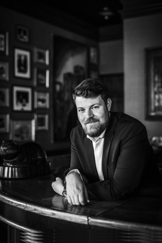
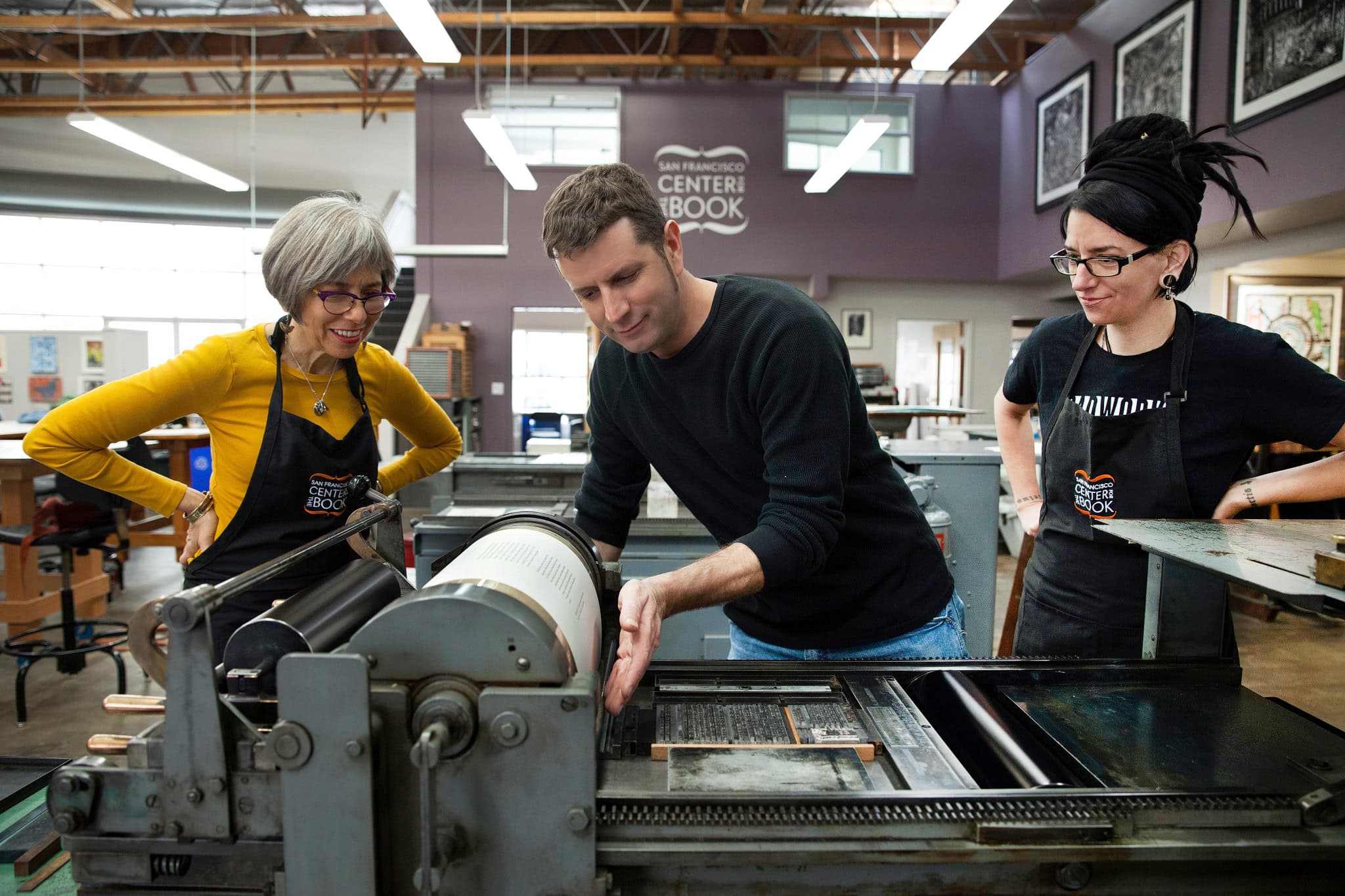
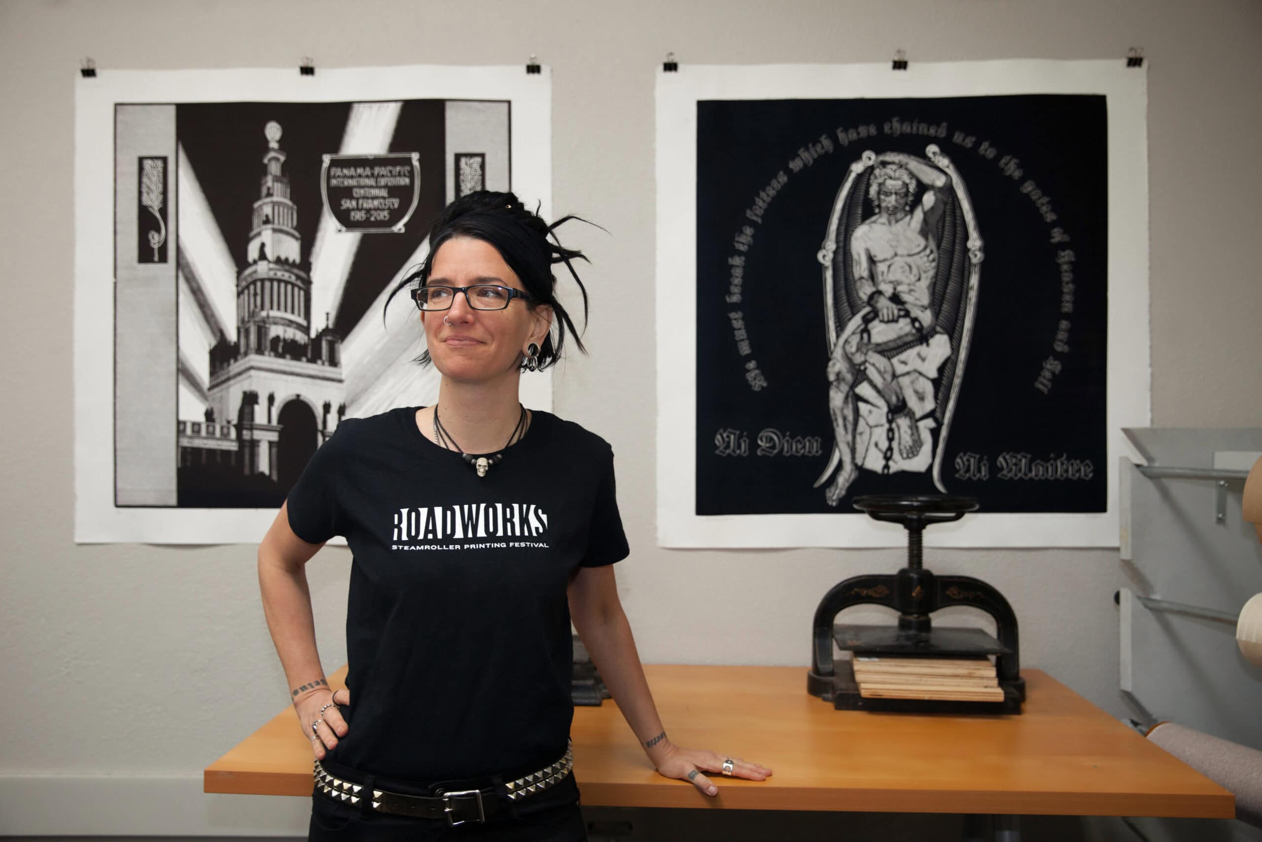
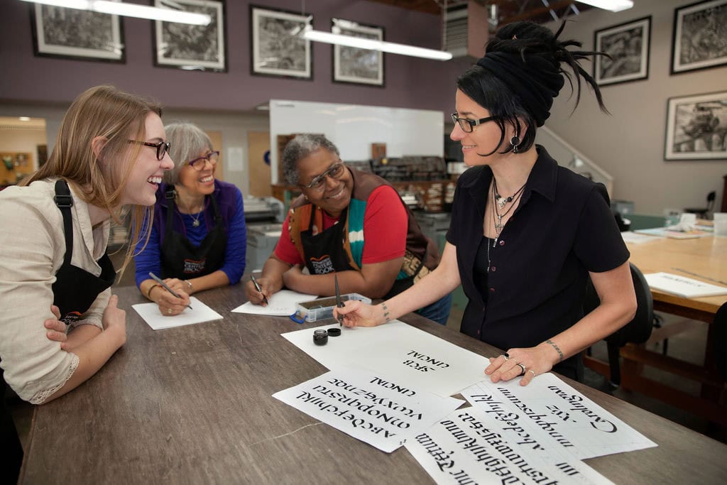
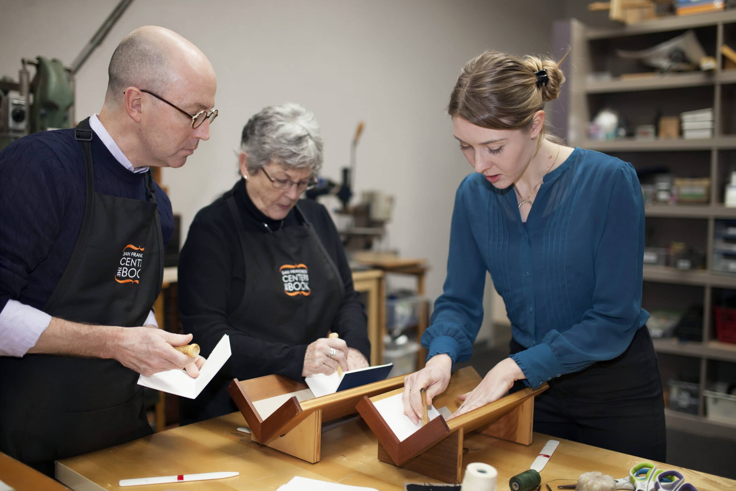
- Staff portraits ~ approachable, authentic, in their element
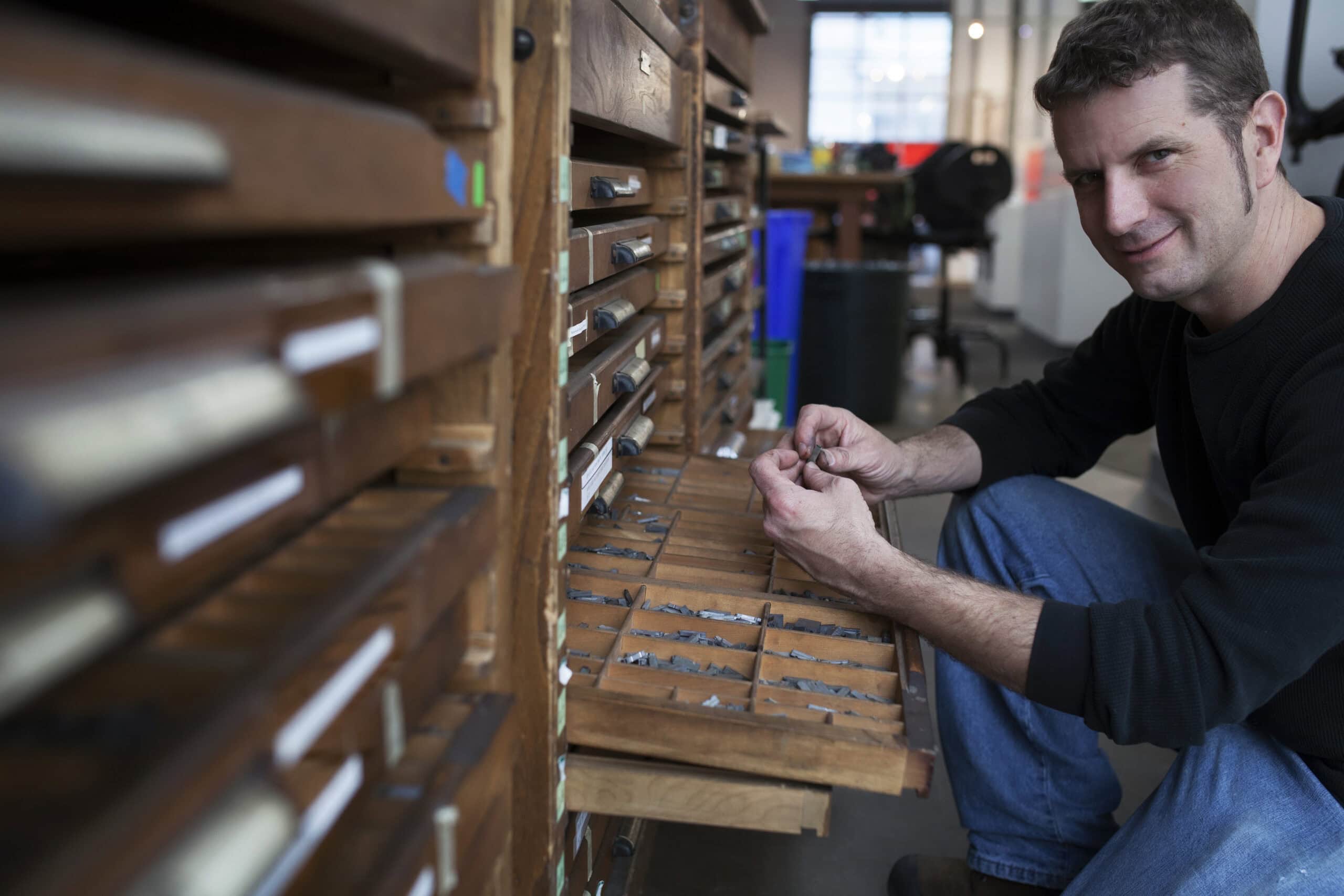
- People at work ~ hands on presses, artists mid-process, classes in session
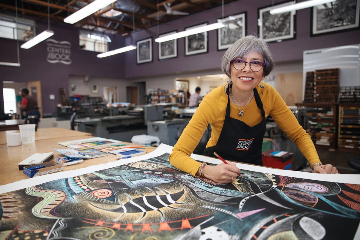
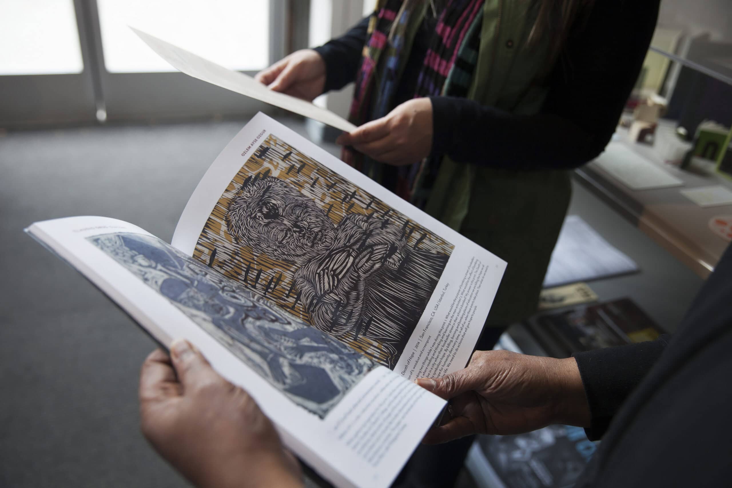
- A featured artist ~ someone who uses SFCB’s facilities, photographed alongside their work
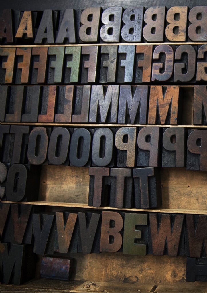
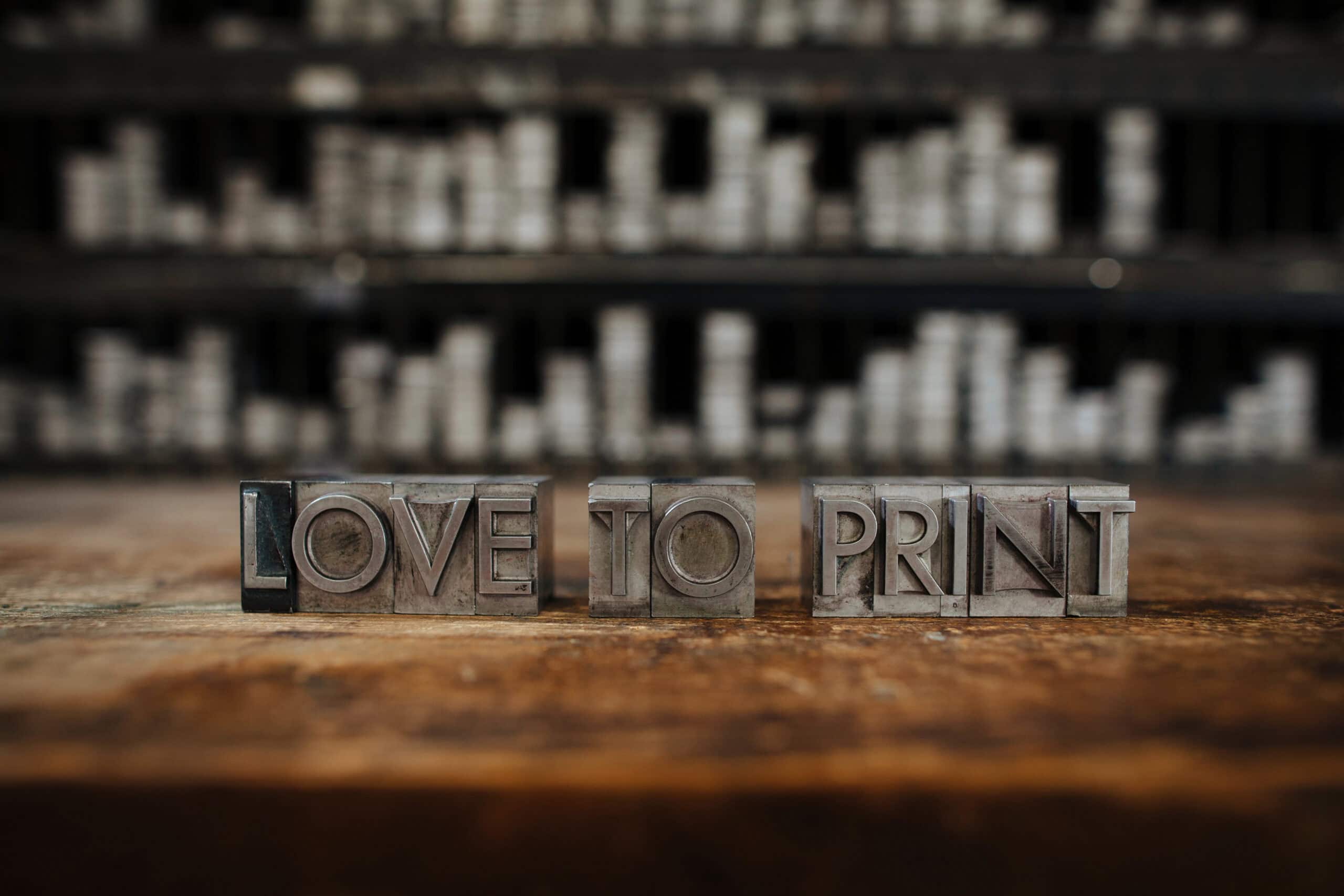
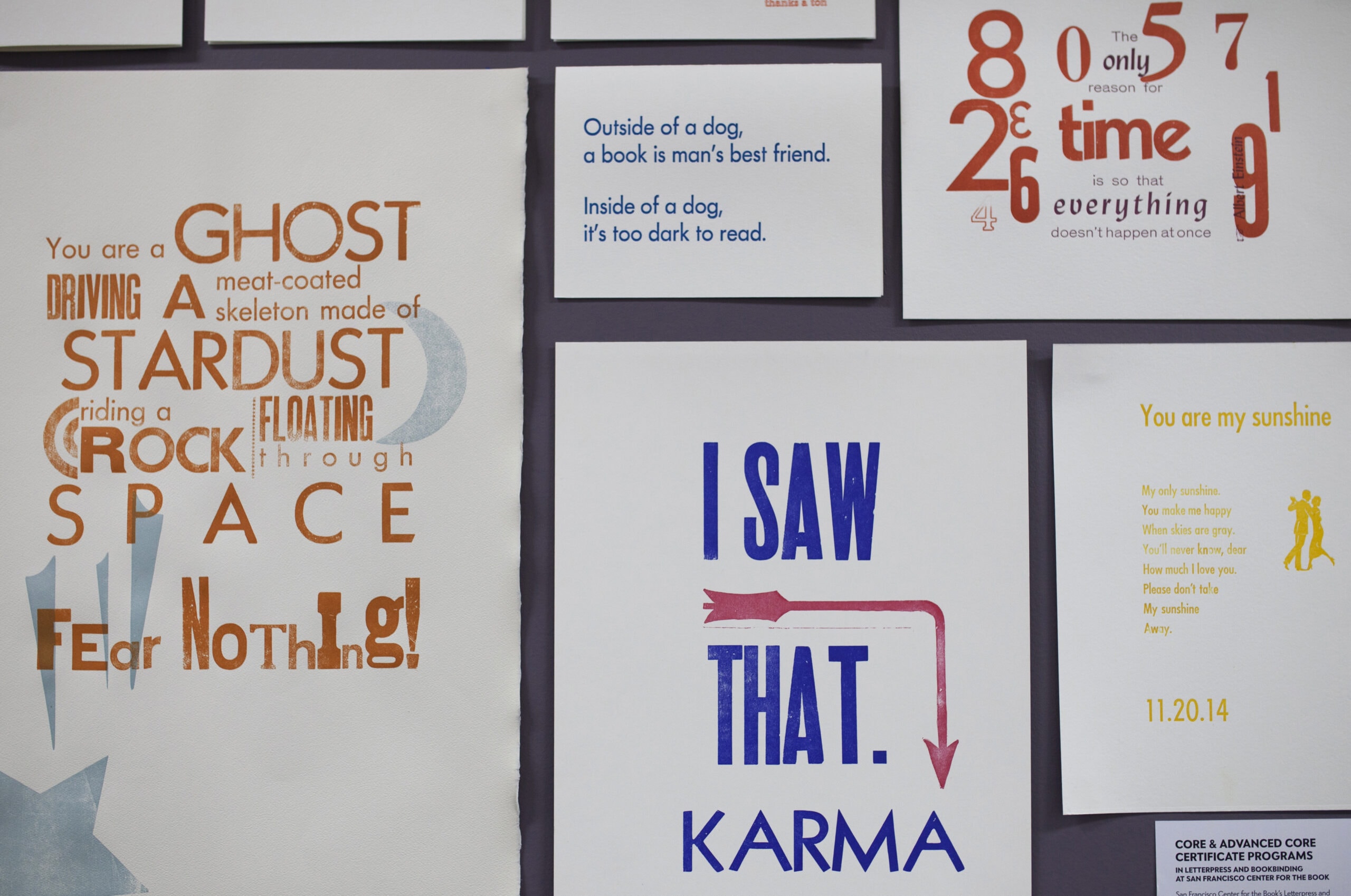
- Detail shots ~ the textures, tools, and materials that make the place feel alive
The Approach
Creating authentic-feeling images takes planning. We scheduled the shoot during a quieter time at the center, so a handful of artists were naturally present and working without the chaos of a full house. Lighting was a priority, so timing was deliberate. We chose a window that gave us the best natural light in the space.
From there, it was about building scenes that felt true to SFCB. Classes were staged with real students from the center, and staff demonstrated the hands-on processes they know by heart. The result is photography that looks lived-in and spontaneous ~ because the people in it are genuine, even if the moment was composed.
Detail shots grounded everything in the physicality of the craft: ink-stained rollers, folded paper, the grain of a wood block. These small moments add up to something larger ~ a visual language that says this is a place where things are made.
The Result
A cohesive library of images that give SFCB’s website the warmth and specificity their community deserves. The photography reflects an organization that is welcoming, creative, and deeply rooted in craft ~ and gives prospective students, donors, and collaborators a real sense of what it feels like to be there.
-
Personal Branding Photography : Opera Singer : Christopher
Case study · Personal branding Christopher OPERAtic tenor The Client Christopher Oglesby is an American tenor performing…
-
Personal Branding Photography : Architect : Colleen
Case study · Personal branding Colleen : Even Space ARCHITECT Branding Photography Architects are visual communicators by…
-
Creative Branding Photography – Sound Designer, Sound Engineer, Musician – Liz new shoot
Case study · Personal branding Liz SINGER-SONGWRITER,COMPOSER,AUTHOR, PROFESSOR The Client Liz Ryder is a Northern California-based folk…
-
Creative Professional Branding Photography for Musician Liz
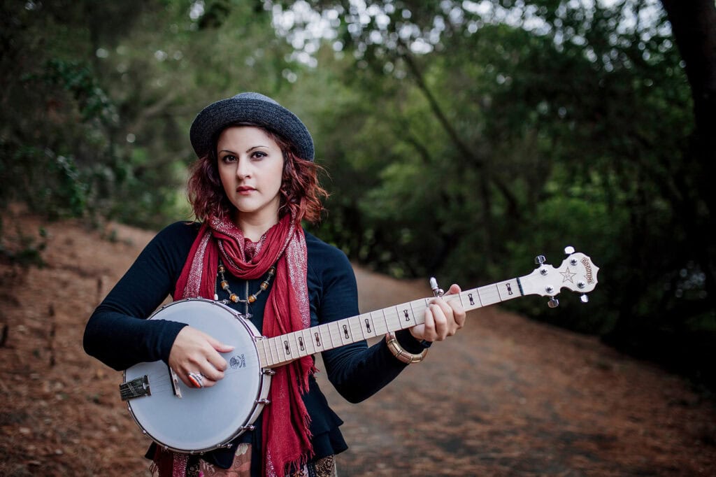
Personal branding· Liz MUSICIAN Liz Ryder is a Northern California-based folk singer-songwriter, composer, author, professor, and eco-acoustic…
-
Personal Branding : Somatic Life and Leadership Coach · Speaker · Facilitator- Jamie Greenwood
Case study · Personal branding Jamie Greenwood Somatic Life & Leadership Coach · Speaker · Facilitator ·…
-
San Francisco Center for the Book
ARTISTS IN OAXACA Maecenas sed diam eget risus varius blandit sit amet non magna. Cras mattis consectetur…